
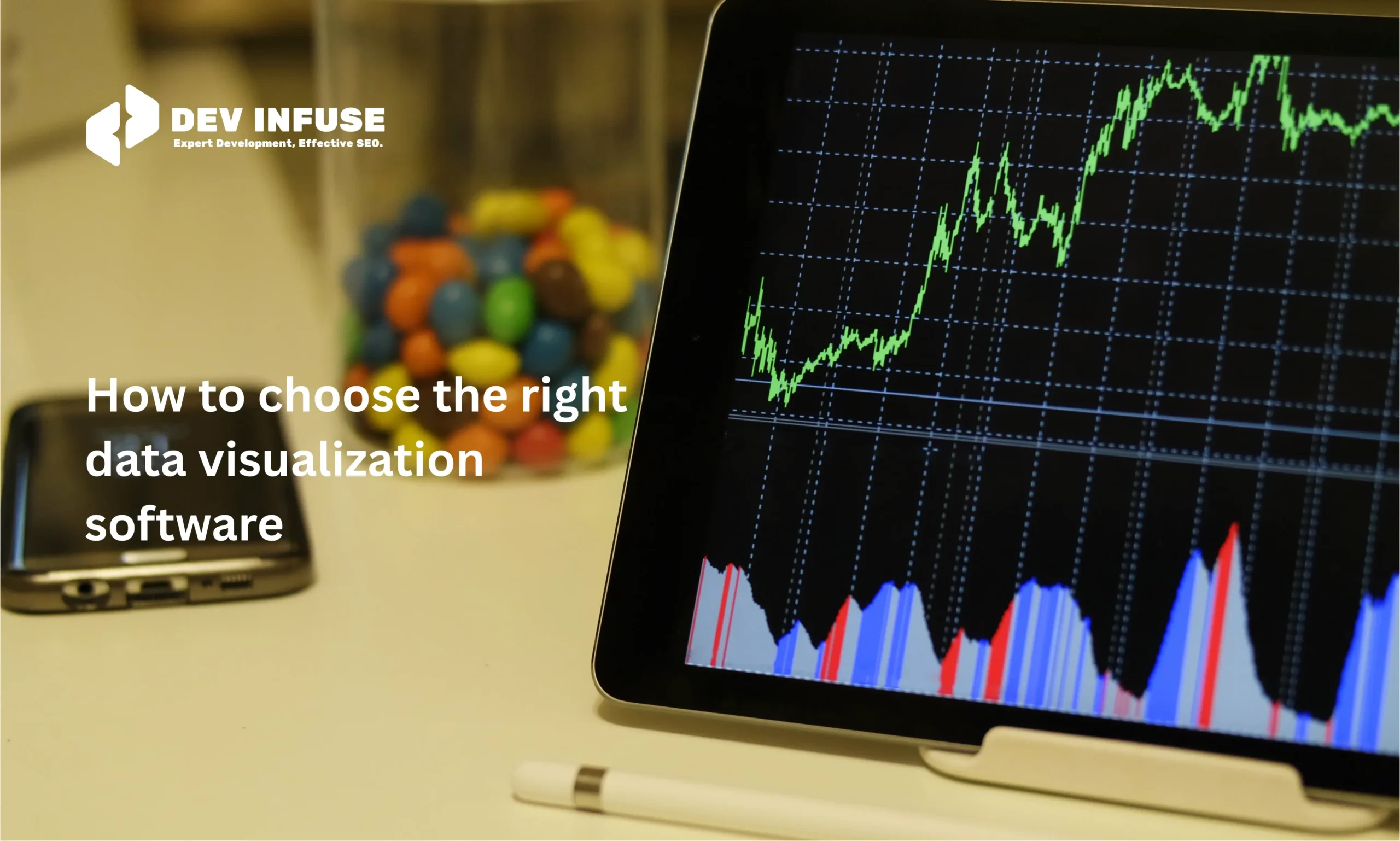
How to Choose the Right Data Visualization Software
Choosing the right data visualization software can be difficult. Many tools look similar. Each one claims to make data simple. But not every tool fits every need. You must know your goals before you choose. You should also know the type of data you work with. Clear data leads to clear decisions. The right tool makes that easier. This guide will help you focus on what truly matters. It will show you how to compare features. It will also show you how to avoid common mistakes. Good choices start with good information. This article gives you that.
The second part of choosing well is understanding your workflow. You need software that fits into your daily tasks. You also need something your team can use. Complex tools slow people down. Simple tools support better results. Cost also matters. Support matters too. Test tools before buying. Look for flexibility. Look for strong performance. With the right approach, you can choose confidently.
Table of Contents
Why Choosing the Right Tool Matters
Choosing the right data visualization tool is important because it shapes how you see, explore, and interpret your data. The right software turns raw numbers into clear visuals that highlight trends, patterns, and outliers. This makes it easier to understand performance, spot issues early, and communicate insights to others. Good visuals support smarter decisions and help you act with confidence.
The right tool also saves time and reduces frustration. When a tool fits your workflow, you can connect data smoothly, build visuals quickly, and update dashboards without extra steps. A simple interface helps you work faster, even if you are not highly technical. For teams, the right tool supports collaboration, version control, and consistent reporting across departments.
Choosing the wrong tool can slow down progress. Limited features, poor performance, or complex menus can lead to delays and errors. You may spend too much time troubleshooting instead of analyzing. The right tool avoids these problems by giving you accuracy, speed, flexibility, and a smoother experience from data upload to final report.
Essential Features to Compare
When choosing data visualization software, the features matter as much as the price. The right set of features helps you build clear visuals, work faster, and share insights easily. This section explains the most important features you should check before deciding.
Chart options
A good data visualization tool should offer a wide variety of chart options. Basic charts like bar charts, line charts, and pie charts are essential for simple data presentations. At the same time, advanced charts such as heatmaps, treemaps, and scatter plots are valuable for deeper analysis. The tool should also allow customization of colors, labels, and layouts, ensuring that your visuals clearly convey the intended message.
Data connections
Strong data connectivity is essential for any data visualization software. Your tool should be able to connect seamlessly to spreadsheets, databases, and cloud storage. It should also support APIs and live data sources to ensure your data is always current. Automatic refresh is a major advantage, keeping dashboards updated without requiring manual effort. This reduces errors and ensures accuracy. Overall, reliable data connections save time and make your workflow much smoother.
Interactivity
Interactivity makes data visuals more engaging and insightful. Features like filters, drill-downs, tooltips, and clickable elements allow viewers to explore the data on their own. This helps them understand details without overwhelming the chart with too much information. Interactive dashboards are particularly valuable for presentations and team reports, as they encourage exploration and make complex data easier to digest. By adding interactivity, your visuals become not just informative but also actionable.
Automation and updates
Automation helps you work more efficiently and reduces repetitive tasks. A good data visualization tool should support scheduled refreshes, auto-generated reports, alerts, and repeatable workflows. This ensures that your data is always up to date without manual intervention. Automation also keeps your team informed with timely updates and consistent reporting. By streamlining these processes, you save time, minimize errors, and maintain reliable insights across your organization.
Top 5 Data Visualization Software
Choosing the right data visualization software is essential for analyzing, understanding, and presenting data effectively. The right tool helps you uncover insights quickly, communicate findings clearly, and make informed decisions. With many options available, it’s important to know the strengths, ideal use cases, and unique features of each tool. Here are the top five tools widely used by businesses and analysts.
Tableau Advanced Visualizations and Analytics
Tableau is known for its powerful visualization capabilities and intuitive drag-and-drop interface. It supports both simple charts and complex dashboards, making it suitable for business users and analysts. Tableau offers interactive storytelling, real-time updates, and strong integration with multiple data sources. Its main drawback is a higher cost compared to other tools.
Microsoft Power BI Affordable and Microsoft-Friendly
Power BI integrates seamlessly with Microsoft products like Excel and Azure. It is cost-effective and ideal for small to medium teams. It offers AI-powered insights, natural language queries, and easy-to-share dashboards. Power BI is great for collaboration and supports both technical and non-technical users.
Looker (Looker Studio) Scalable Cloud-Based BI
Looker is a cloud-native platform designed for scalability and embedding analytics into applications. Using LookML, users can define business logic and create reusable metrics. Looker works well for teams that need governed analytics and want to integrate dashboards into workflows or apps.
Qlik Sense Flexible Analytics with Associative Exploration
Qlik Sense uses an associative data engine that lets users explore data from multiple angles. It includes AI-powered suggestions and supports cloud and on-premise deployment. Qlik Sense is ideal for organizations needing self-service analytics while maintaining data governance.
Zoho Analytics User-Friendly and AI-Powered
Zoho Analytics provides a simple drag-and-drop interface and connects to hundreds of data sources. Its AI assistant, Zia, helps generate insights automatically. Zoho is affordable and suitable for small to medium teams, offering dashboards, reporting, and collaboration features without the complexity of larger enterprise tools.
Future Trends in Data Visualization Software
Data visualization is evolving quickly as organizations rely more on data-driven insights. Modern tools are becoming smarter, faster, and more interactive, helping users uncover trends and patterns efficiently. Businesses are looking for solutions that simplify analysis and improve decision-making. The following five trends highlight the directions shaping the future of data visualization software. Each trend reflects how technology and user needs are changing the way we interact with data.
AI-Powered and Smart Analytics
Artificial intelligence is becoming a core part of visualization tools. Future software will detect patterns automatically and clean data without manual effort. AI will also recommend the most relevant chart types and visual layouts. Generative AI can create full dashboards based on insights. These advancements will make analysis faster, easier, and more intuitive for users.
Augmented Analytics and Natural Language Interaction
Augmented analytics combines AI with traditional analytics to simplify data preparation and insight generation. Natural language interfaces allow users to ask questions in plain English. The software can then generate charts, reports, or dashboards automatically. This approach reduces manual work for analysts. It also makes data exploration accessible to non-technical team members.
Real-Time and Immersive Visualization
Real-time dashboards are becoming critical for rapid decision-making. They update automatically as new data arrives. Augmented reality (AR) and virtual reality (VR) are also enabling immersive data exploration. Users can view data in 3D spaces and interact with it spatially. This makes complex datasets easier to understand and analyze visually.
Data Storytelling and Automated Narratives
Visualization is moving beyond charts into full storytelling. Future tools will pair visuals with automatically generated text summaries. This helps non-technical users understand insights quickly. Dashboards will communicate trends both visually and narratively. The combination of charts and narrative simplifies data interpretation for all audiences.
Embedded Analytics in Everyday Applications
Analytics is increasingly being built directly into business software. Teams can access dashboards without switching between tools. Insights are available in the applications they use every day. This makes data-driven decision-making faster and more convenient. Embedded analytics ensures insights reach the right users at the right time.
Conclusion
Choosing the right data visualization software is important for understanding and presenting your data clearly. The right tool saves time, reduces errors, and helps you make better decisions. Focus on your goals, your audience, and the type of data you work with.
Look for tools with the features you need, easy usability, and good performance. Consider cost, security, and integration with your workflow. Test the software before committing. With careful evaluation, you can pick a tool that fits your needs and helps your team work efficiently. The right choice makes data simple and actionable.
Liam Carter
Liam Carter is a full-stack developer and founder at Dev Infuse, where we help businesses build, scale, and optimize digital products. With hands-on expertise in SaaS, eCommerce, and performance-driven marketing, Liam shares real-world solutions to complex tech problems. Every article reflects years of experience in building products that deliver results.
Social List